
_Rajneesh Suri
Suri is a marketing professor in the LeBow College of Business.
Big name companies like Target, Mattel, Staples and The North Face are keeping things nice and easy — at least, when it comes to the font they use to convey their brand to consumers. They all use Helvetica — an easy-to-read, so-called “fluent” font.
One might assume that fluent fonts are the best way to communicate with consumers.
But LeBow College of Business Professor Rajneesh Suri has found that disfluent, or more ornate fonts such as Bradley, buck that trend, at least when it comes to showing prices, and that they turn browsers into buyers more often.
Shoppers’_Script
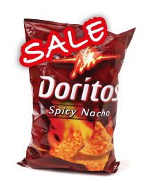
Twenty-three percent more bags of Doritos sold when the prices were displayed in the “disfluent” Bradley font, compared with Helvetica.
“Marketers have a tendency to go to the easy-to-read font,” he says. “But when it comes to actual purchase behavior, we found that, when we used the more ornate font, sales were significantly higher.”
In a study published in the Journal of the Academy of Marketing Science, Suri and a team of researchers went into a supermarket for a month and analyzed how bags of Doritos chips sold when promotional sale prices were listed in the fluent Helvetica font compared with how they sold when promotional sale prices were listed in the disfluent Bradley font.
They found that 23 percent more bags of Doritos sold when the prices were displayed in the Bradley font.
They also asked people to look at two fictional ads for cell phones, and found that participants found fluent prices easier to grasp, but that sales promoted using a disfluent font inspired more purchases.
Suri doesn’t think that marketers should go and switch all of their sale price displays to the Bradley font, but it is worth considering — and more research.
“These fonts make them more interesting to the participant,” says Suri. “Consumers are more engaged when the fonts look good.”